Introduction
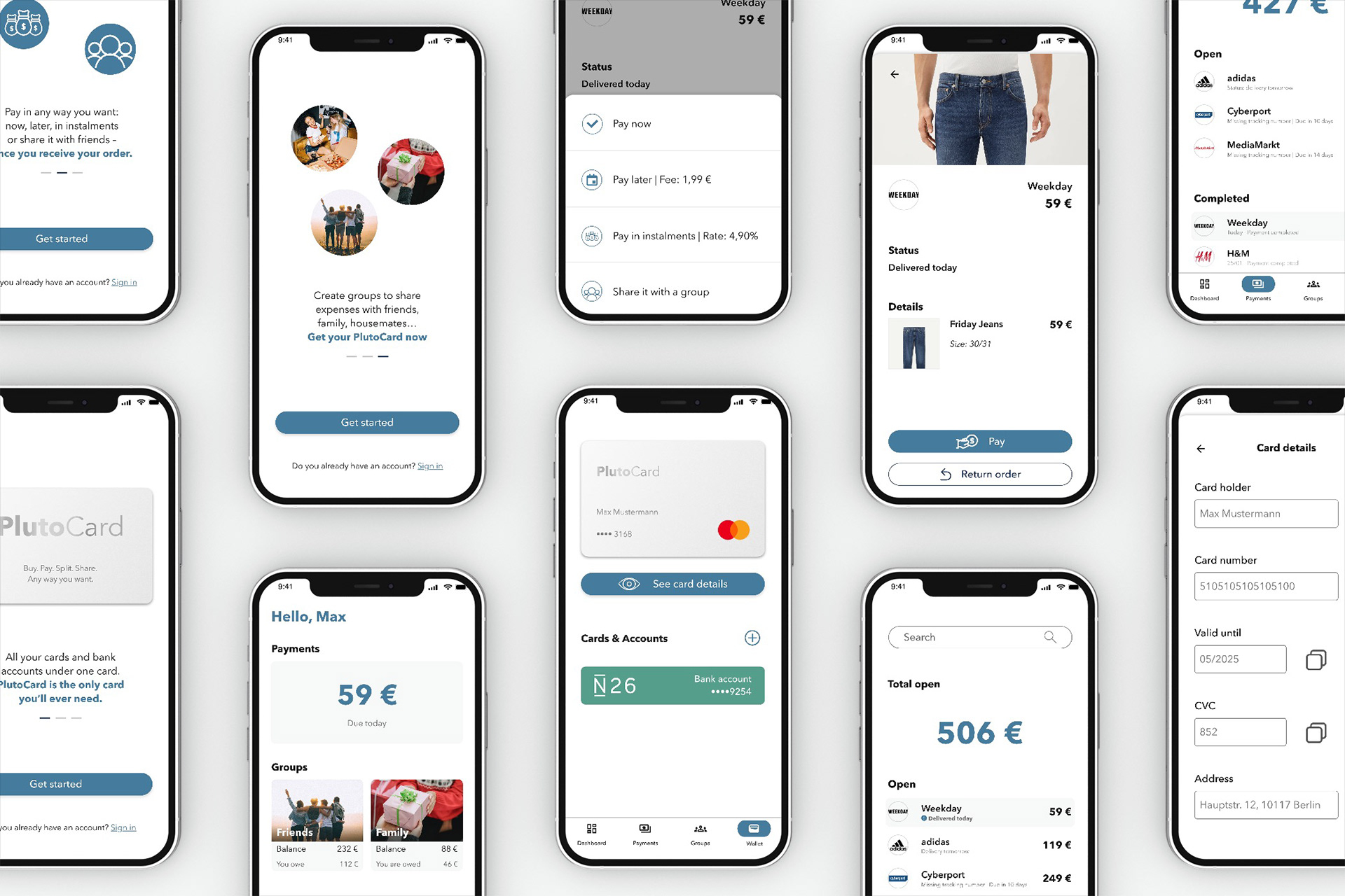
Pluto is a project that I worked on during my UX design certification from CareerFoundry. Pluto is a digital wallet app that gives users flexibility and better control over their payments when shopping online. They can centralize all their cards and accounts under one card, pay only when they receive the product and decide freely how they want to pay for it – including sharing the payment with others.
Understanding the problem
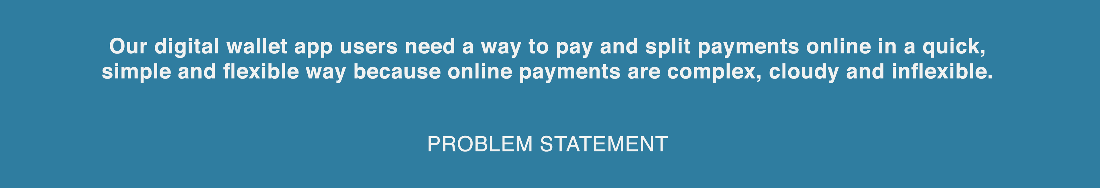
When I first considered the problem space of payment apps and their existing issues, I had three starting points: the complex checkout process of solutions like Paypal, the lack of transparency of apps like Klarna and the absence of a payment method that directly offers the possibility of sharing payments with others. Based on these first observations, I defined my problem statement:
I then drafted my first thoughts about a potential solution:
"An app that allows users to pay for things online in the most simple, quick and flexible way possible: pay now, decide later how. After the purchase process is complete, users can decide in the app what payment method they want to use, how they want to pay (all at once, in instalments or later) and if they want to split this payment with someone else."
Target audience
As the minimum age required to open an own bank account is 18, I defined this will be the minimum age for Pluto's target audience. Since users need to feel safe and comfortable doing financial transactions via smartphone, like most digital natives do, I expected the upper age range to be 40.
User research

To better understand the problem space and validate my first observations, I conducted a series of generative user interviews, with the following research goals:
- Better understand the online shopping and digital payment habits of the users
- Identify the most important issues of the current solutions that can be improved upon
- Understand the cost/expenses splitting habits of the users and how they usually handle it
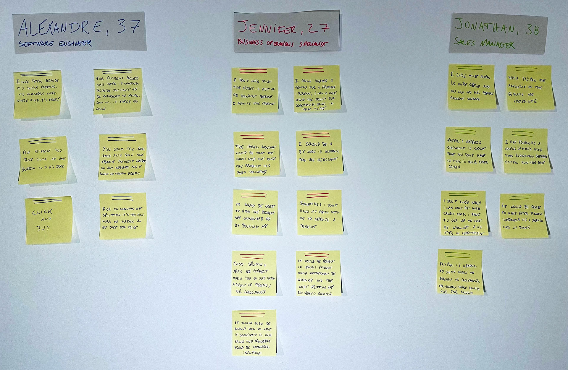
I wrote down the most relevant notes from the feedback I received and created a research area, then an affinity map:
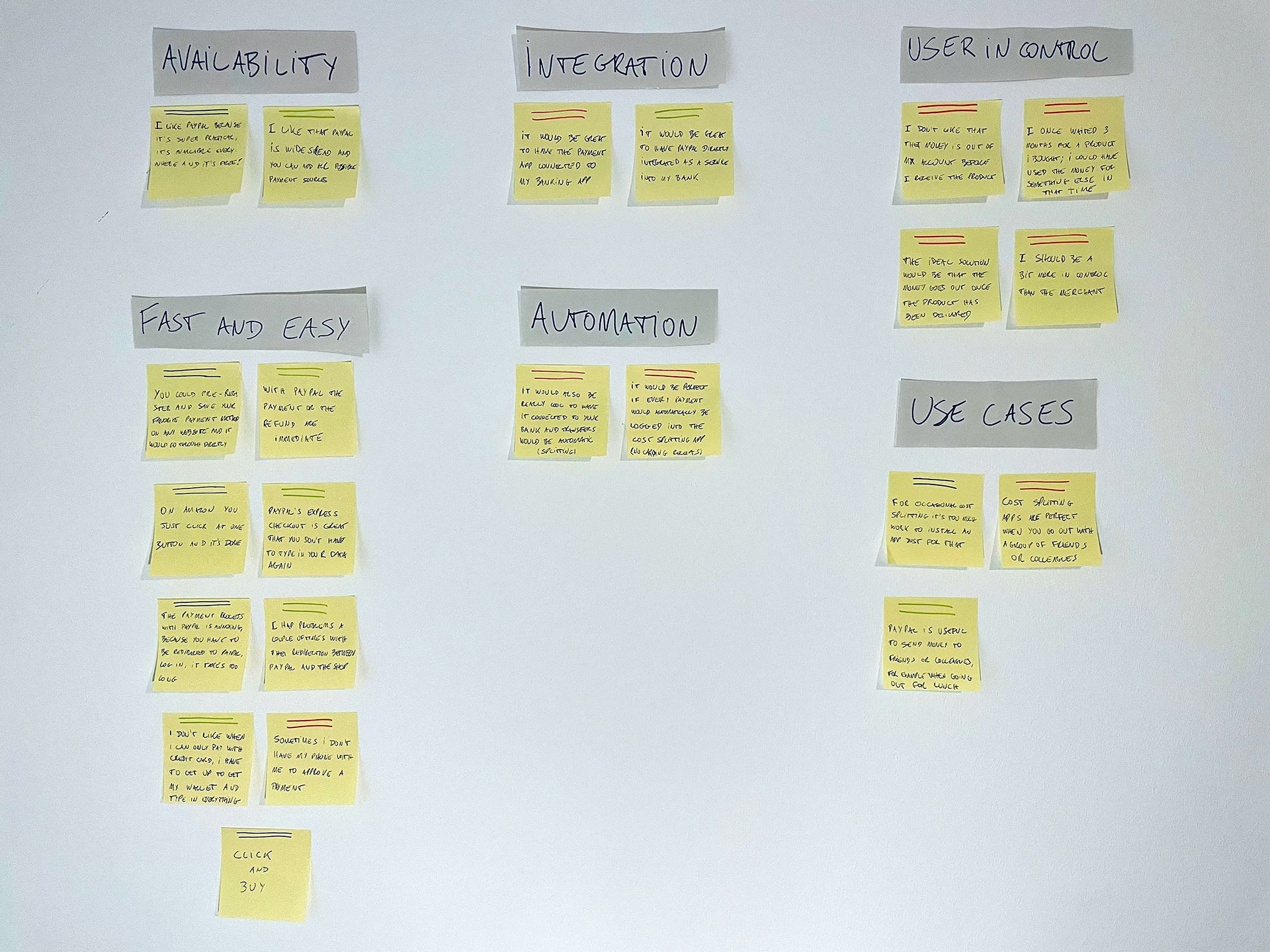
The most important learnings and I insights I got from it were:
- The easiest and fastest way to be available and accepted in every single store is to generate our users one or more virtual credit cards
- The app should offer an easy way to copy all necessary data users needs when using the card for the first time in a store
- Users should be able to add multiple payment sources
- Users want more control over their online payments, and only pay once they receive their order
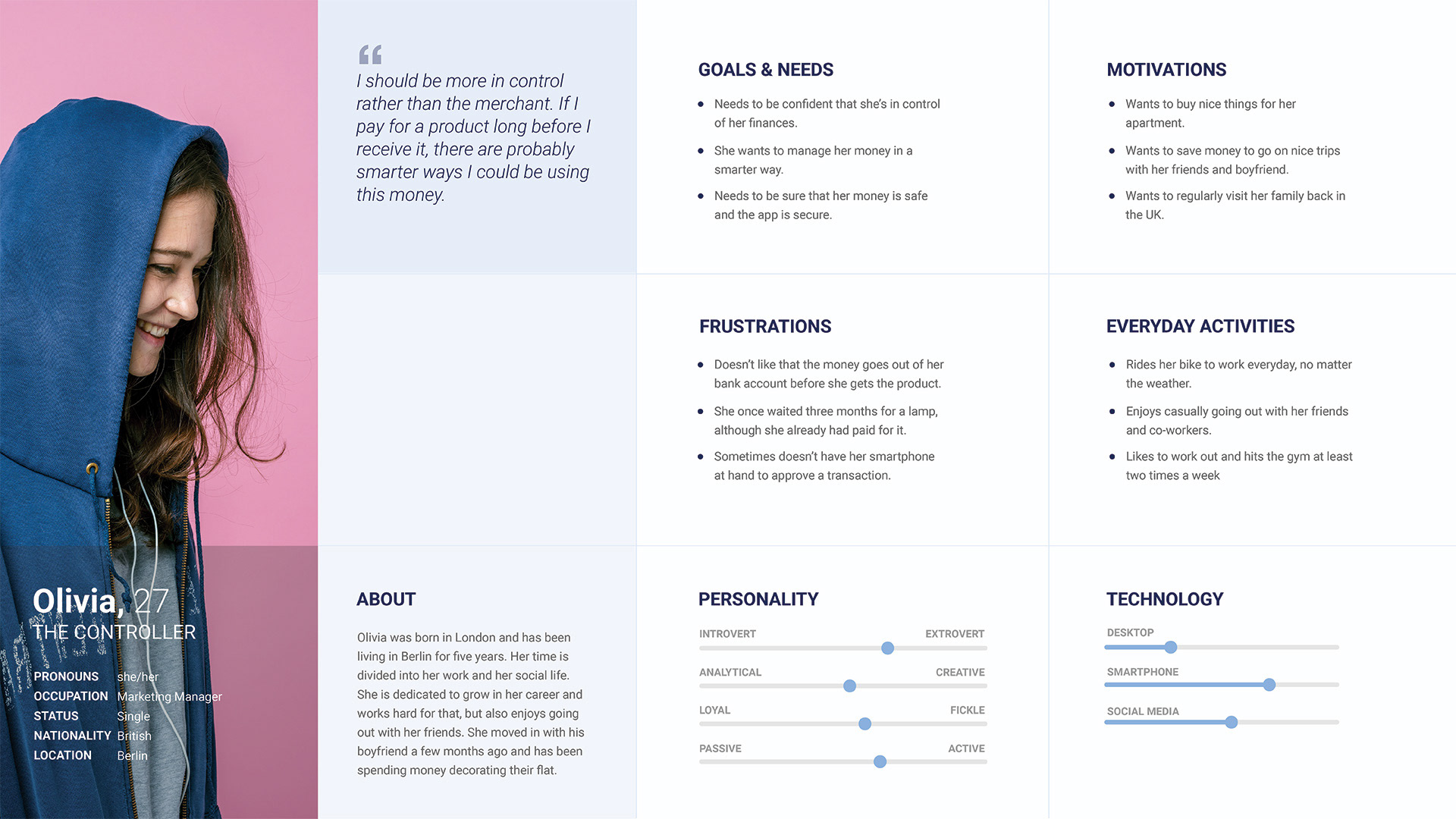
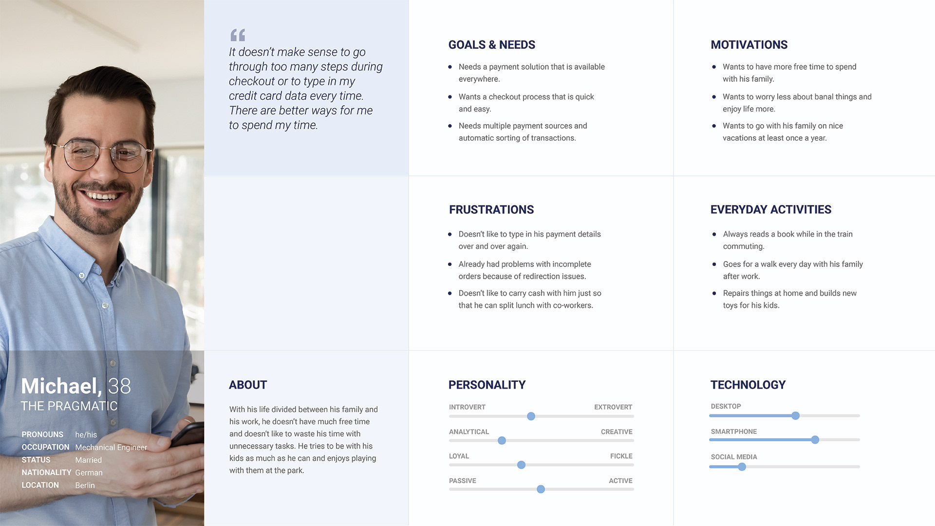
With my first user interviews I was able to confirm users’ dissatisfaction with the complex Paypal checkout process, but realised that the fact that you have to pay for a product way before receiving it was much more relevant to users than the possibility of directly sharing payments with others. Based on that findings, I created my users personas, my user journey maps and the user flows.
User Personas
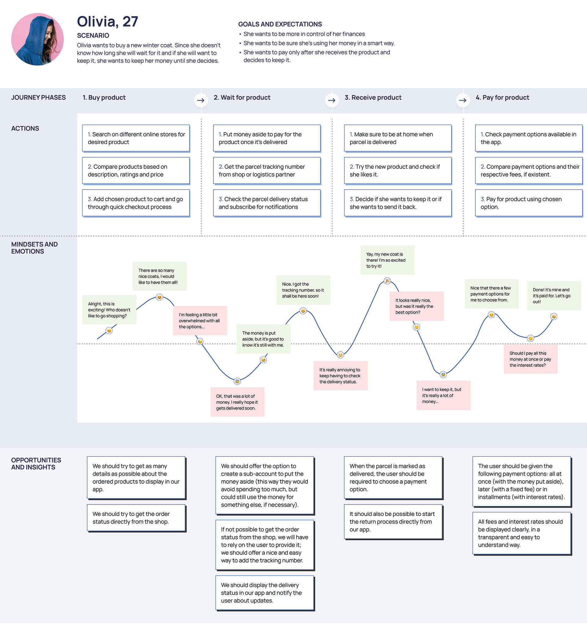
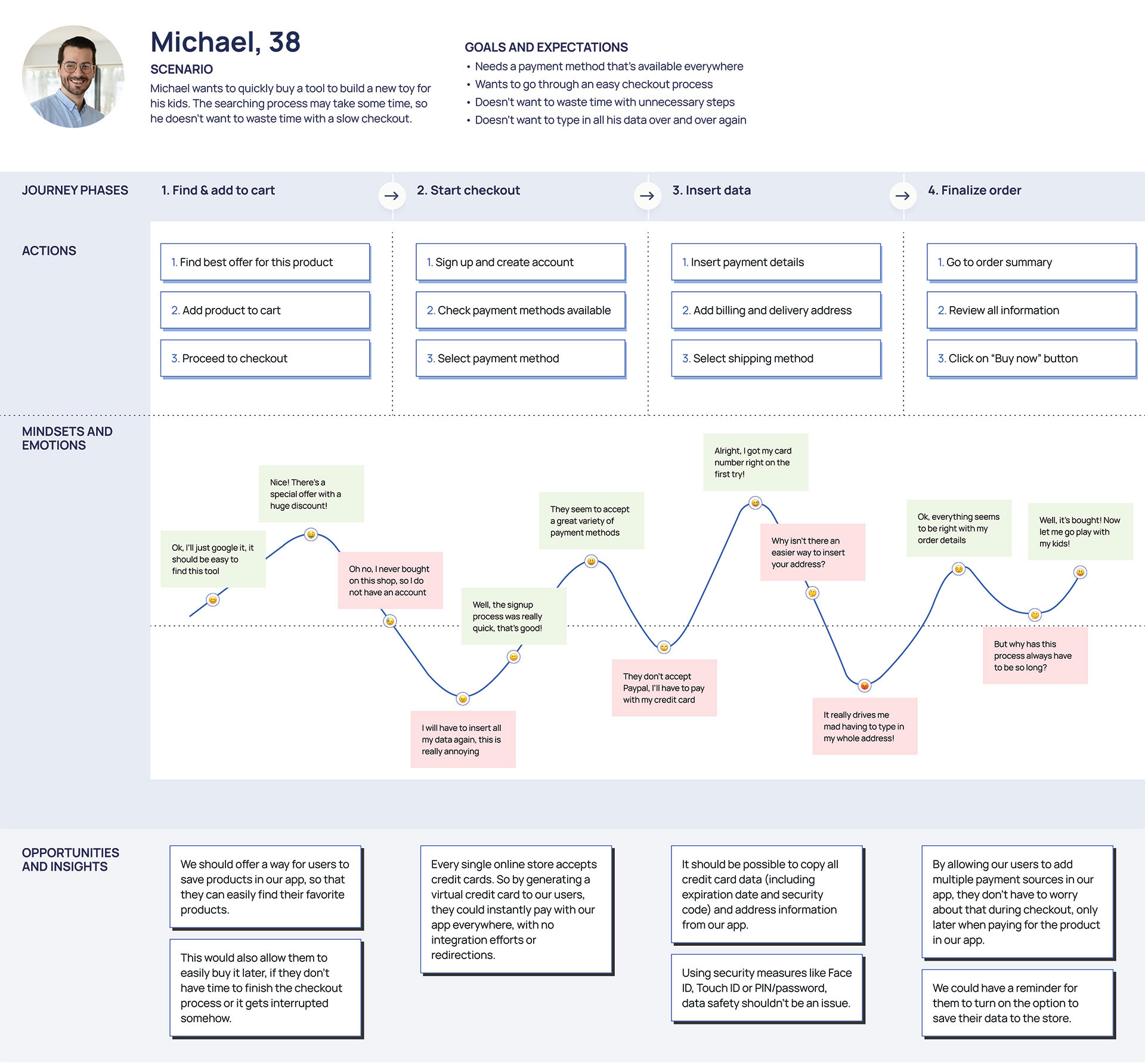
User Journey Maps
User Flows
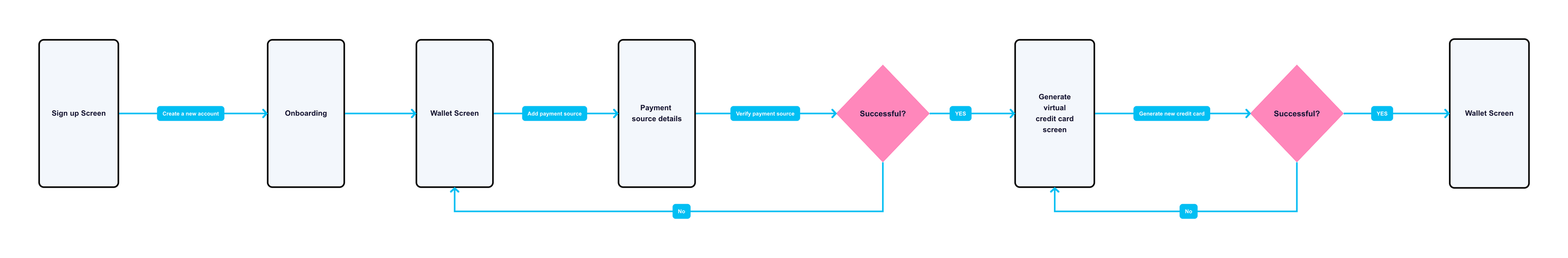
Generate virtual card
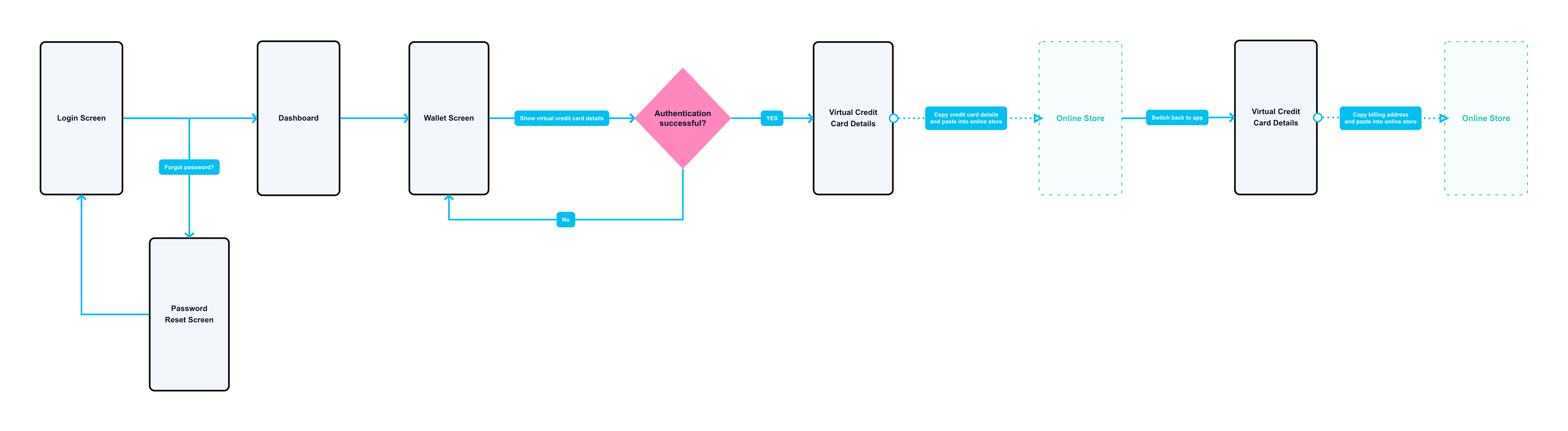
Copy virtual card details
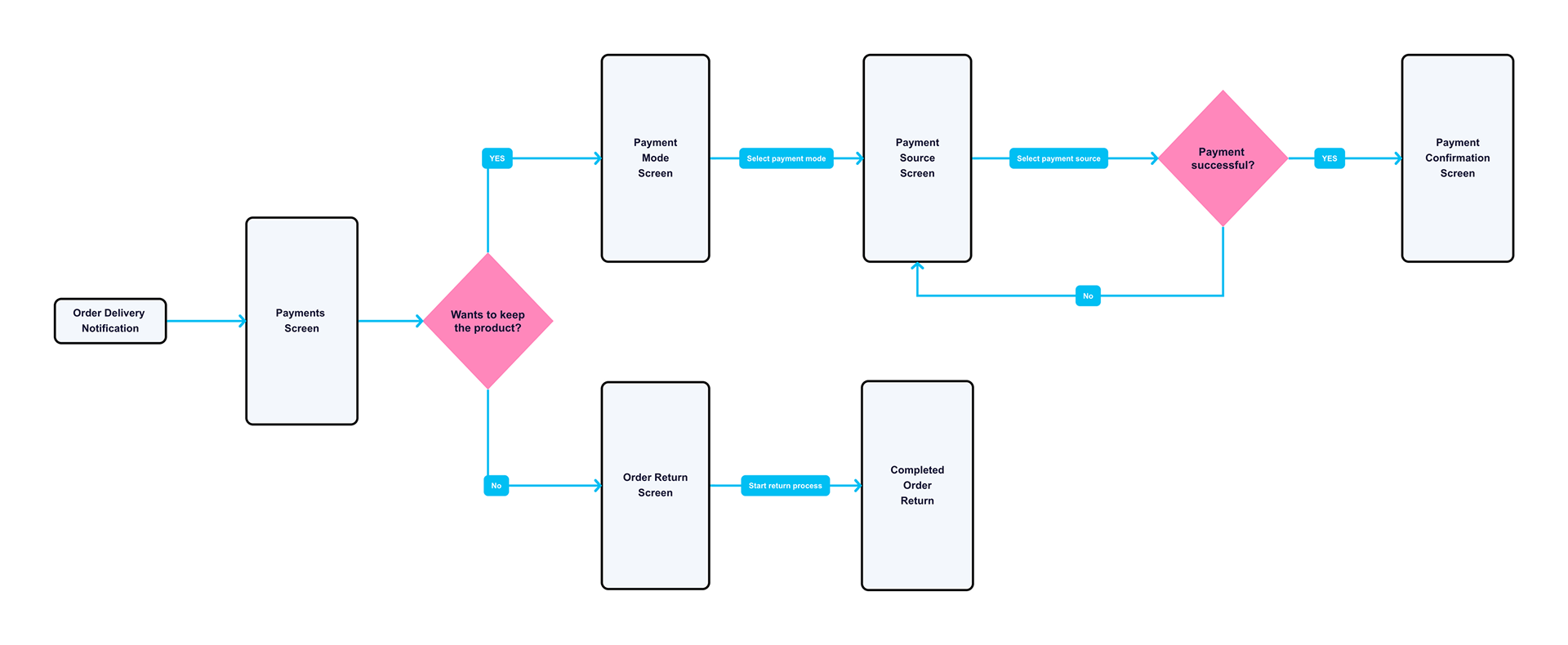
Pay after receiving product
Wireframes & Mockups
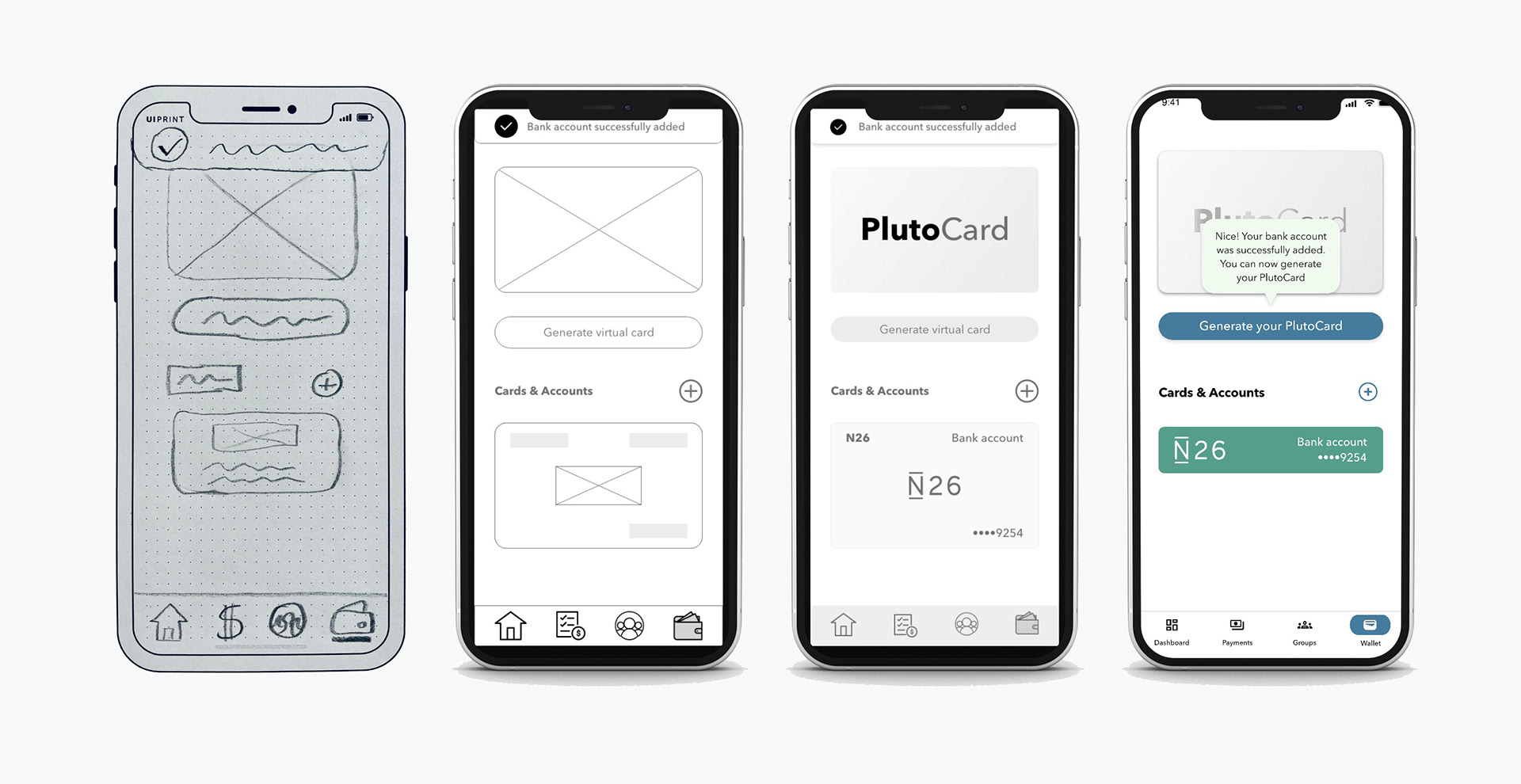
With the users' needs and wishes in mind and following the human-centered design principles, I created a first sitemap of the app and validated its structure with users in a virtual closed card sorting session. After that, I started the wireframing and prototyping process, moving from a hand-drawn low-fidelity prototype, to a digital, interactive high-fidelity prototype. I conducted a usability test with the high-fidelity prototype, and based on the feedback I received, many of the screens and flows went through iterations. I'll dive deeper into the usability test and the UI changes in the following sections, but you can take a look below at some examples of this iterative process:
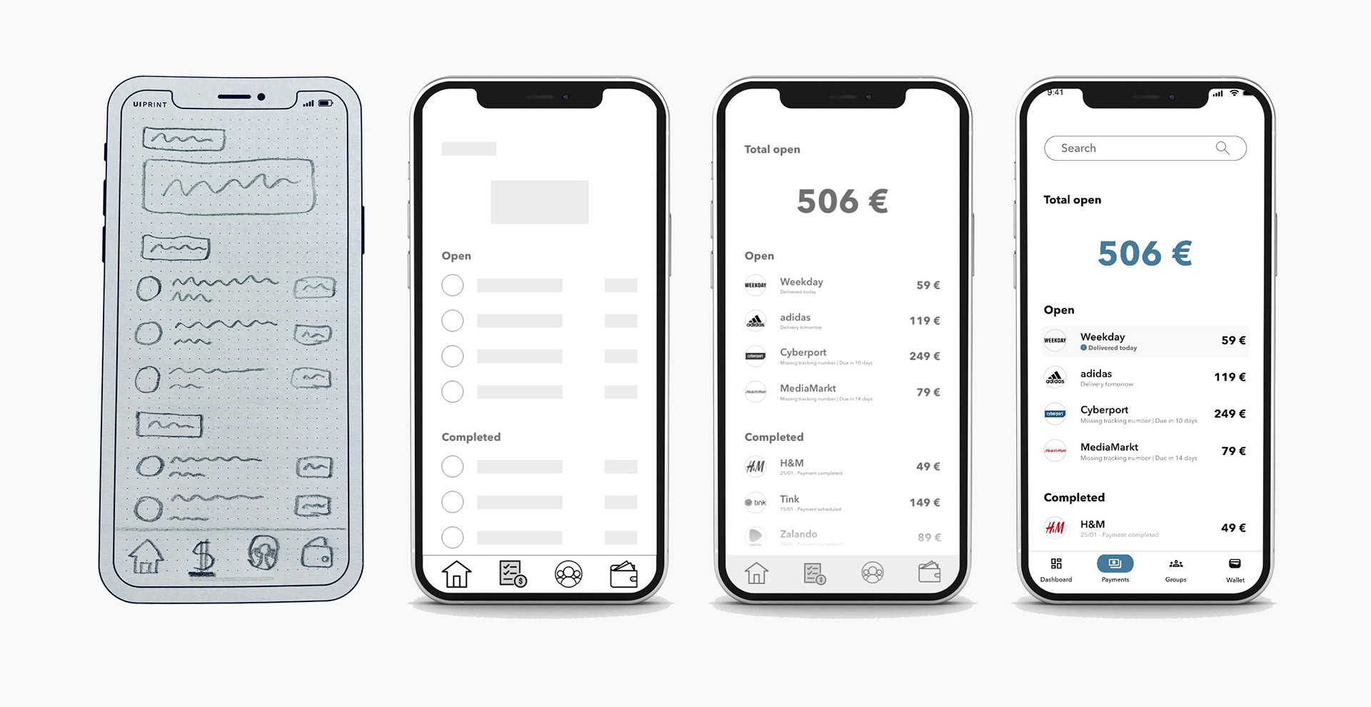
Wallet screen
With the first usability tests, I realised that the process of generating the card was not intuitive enough, leaving some users confused.
With the first usability tests, I realised that the process of generating the card was not intuitive enough, leaving some users confused.
I changed the format of the added bank account, so that it wouldn’t look like a credit card, and made the instructions more clear and motivating.
Payments screen
During the first usability tests, users told me that the payment that is due in the list was not clear enough, so I highlighted it with a different background color, an icon and a bold description.
During the first usability tests, users told me that the payment that is due in the list was not clear enough, so I highlighted it with a different background color, an icon and a bold description.
Based on peer feedback, I also increased the size of all descriptions, to make them more visible and readable. As part of the project requirements from CareerFoundry, I also added a search bar to the screen, so that users could look for past transactions.
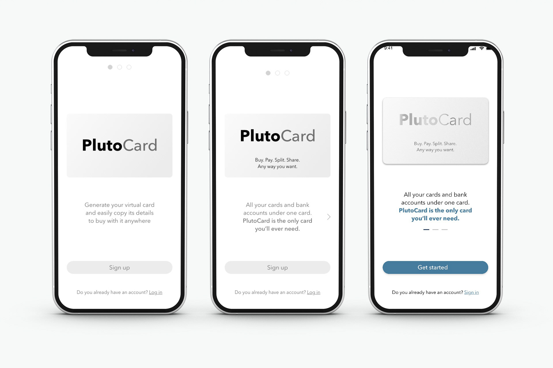
Signup / Onboarding
With the first usability tests, I noticed that the app’s purpose and main benefits were not clear enough. With a preference test I decided for a new version of the onboarding text, as well as a new CTA text.
Based on peer feedback, I also added color to highlight PlutoCard’s claim.
With the first usability tests, I noticed that the app’s purpose and main benefits were not clear enough. With a preference test I decided for a new version of the onboarding text, as well as a new CTA text.
Based on peer feedback, I also added color to highlight PlutoCard’s claim.
Usability Testing

I conducted a remote moderated usability test with six participants to try to uncover any critical issues in my designs. The primary goal of this test was to assess the learnability of Pluto’s key features as a flexible digital wallet and centralised payments app. I wanted to observe and measure if users understand the app, its value, and how to complete the core functions identified in the user research stage.
Test results
Based on the feedback I received from the participants, I created an affinity map.
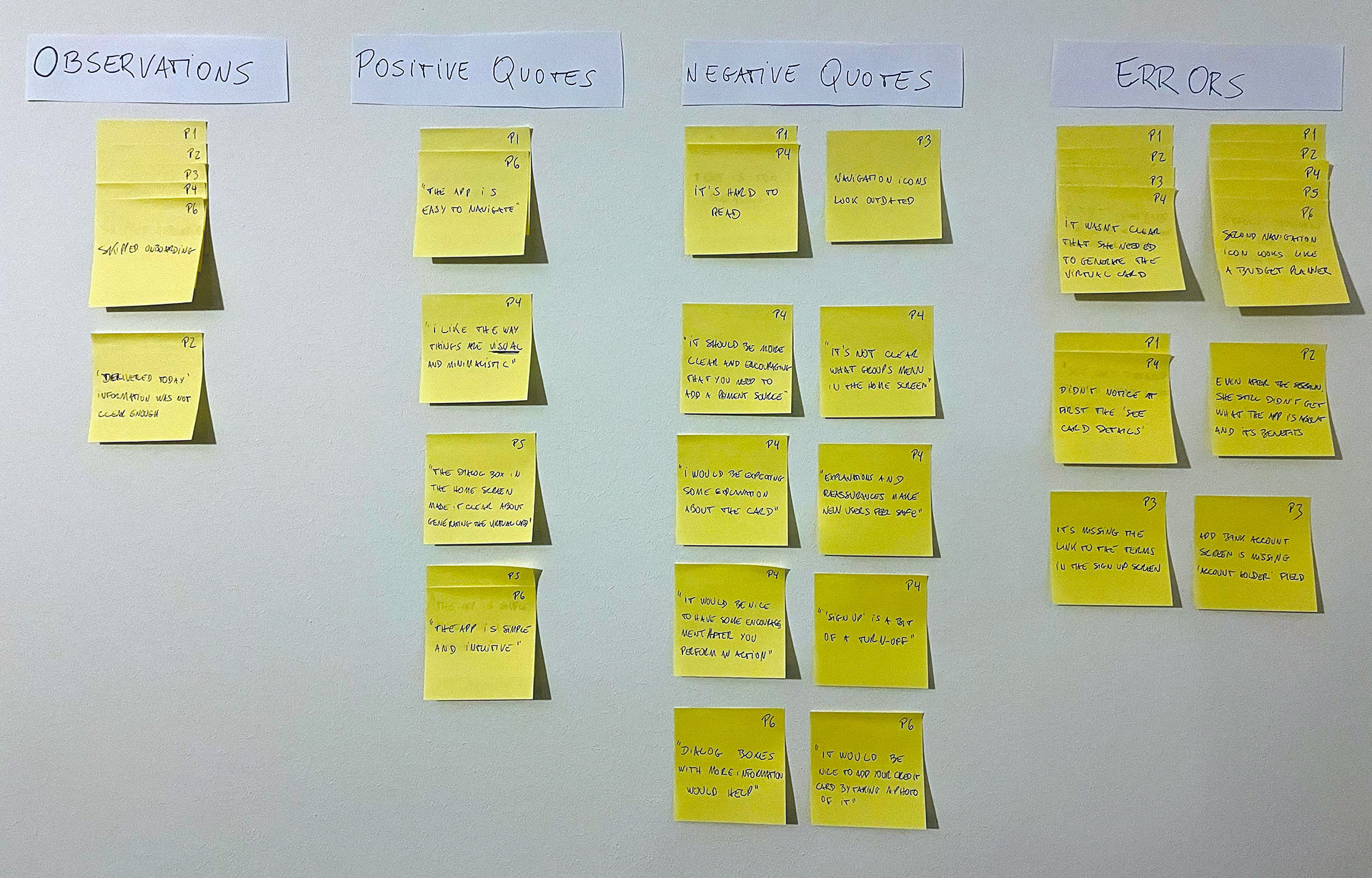
This way, I was able to identify the most critical issues with the prototype:
- Most of the users skipped the onboarding slider, so it needs to be clearer that there are more steps with relevant information available for them
- Some participants didn’t understand they were supposed to generate the virtual card, so I have to make the process more intuitive and the instructions more clear
- The app purpose and its main benefits don’t seem to be clear for all users, so I have to find ways to better communicate them
In general the test revealed to me that I needed to improve some key features of the app, while also better communicating its purpose and benefits. After coming up with some possible changes, I validated the most effective changes through a preference test with a larger group of users. Thanks to the participants' responses in the preference tests I was able to make data-driven decisions about what changes to implement to the prototype, thereby guaranteeing they should be more effective in improving user’s engagement.
After having fixed the most evident UX issues with my prototype, I focused on improving the app UI based on visual design (Gestalt) and emotional design principles, as well as peer feedback. Here are the final results.
(click here to open the prototype on Adobe XD or check the interactive prototype below)